posh_space
Client
posh_space
Service
UI/UX
Date
September 2019
Posh_space — a phygital fashion platform in the ever-growing fashion tech market. Their mission is to bridge the gap between physical and digital fashion by incorporating built-in displays into clothing and wearable accessories. This allows for interactive digital prints, images, and animations to be showcased in a unique and innovative way.
This platform allows brands, artists and tech companies to collaborate and interact directly with each other, without any commission fees.
Main task
The main objective of the redesign was to enhance the service's usefulness by removing any unused elements and optimizing the workspace. Additionally, we carefully examined the uploading form and "select devices" page to improve their functionality.
Modified header. Less height, more air.
Before / After


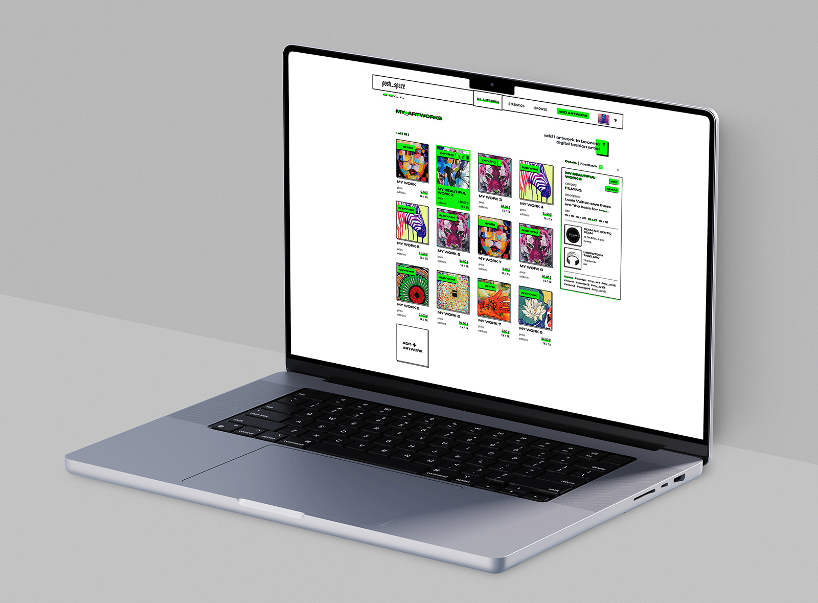
Page: My Artworks
The active artwork now includes a background color and displays the number of feedbacks, as well as action buttons. Details and feedback are organized into tabs, so all the information can be accessed without scrolling your screen. You can also easily close or open this panel as needed. When artworks are inactive, the panel with details and feedback is automatically closed.
Step #1: Select Device
for your new artwork


Page: New Artworks
After selecting a device, you can easily add your new artwork. The artwork fields, uploading form, and preview section are all conveniently located on one screen. Once you upload an image, you can view all of its relevant information. The preview thumbnail is generated from the first uploaded file.


